Atlas Design System for Vrbo and Expedia Group

Goal
Create a set of design patterns and components to standardize the usage of UI elements across internal tools at both Vrbo and Expedia Group.
Project Overview
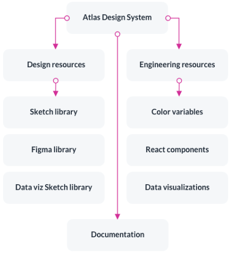
While at Vrbo, I created and managed the Atlas Design System, a design system built around the work our team was doing for internal productivity tools. This system was built upon the work our teammates did on the larger Vrbo Design System, but was more geared towards internal tools which had different needs than consumer-facing products.
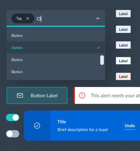
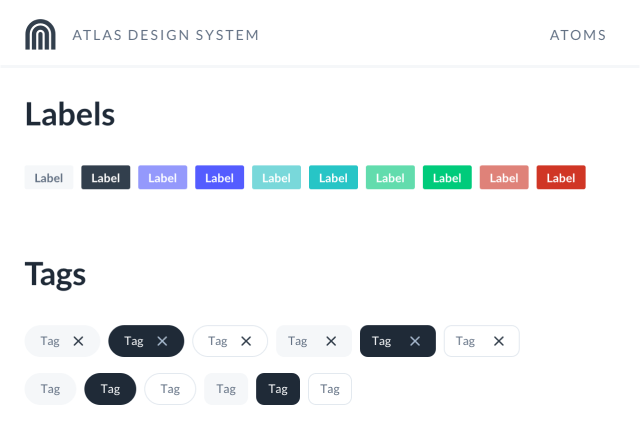
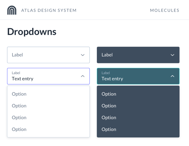
The Atlas Design System includes robust Sketch and Figma libraries, a number of React components, and extensive guidelines and documentation around library and component usage. This was a great way for me to utilize my skills as a Design Technologist, since I could make updates to both the design elements in the library and the React components themselves.
Some of the highlights of this project included:
- Collaborating with other designers and engineers on internal tools, as well as the larger Vrbo design system team, to ensure patterns did not stray too far from the base design system
- Implementing design patterns as reusable React components and assisting with front-end implementation for more complex components
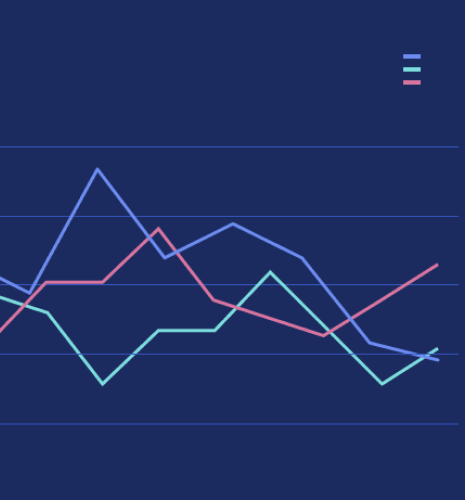
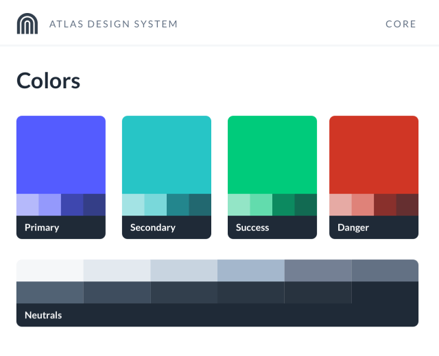
- Collaborating on standardizing a data visualizations library and color palette for both Vrbo and Expedia Group, with a focus on accessibility and data clarity
- Conducting audits to look for potential patterns and where similar UI could be standardized
- Mentoring other designers on how to implement complex patterns in Sketch and Figma so they are reusable and customizable
- Deploying regular updates to the library and creating a contribution system
Building the Sketch Library
Product design work was already underway before I identified a need to create a design system for our team. While the larger design system at Vrbo was excellent, we found ourselves needing new or altered patterns with more of a focus on compact, data-dense UIs. We explored these patterns as a team and I began building up a Sketch library to not only standardize those patterns, but also to speed up each designer's workflow.
Each time a new pattern was proposed, I conducted extensive audits to understand how the team utilized the same or similar patterns, as well as what kinds of customization and variation would be needed. Patterns needed to be flexible for our designers to fully embrace the library, so there are a lot of customization options through the use of nested symbols and layer styles.
Over time, the company began to transition to using Figma, so I also developed a Figma version of the Sketch library and maintained both in tandem.
Documentation
As the library grew, so did its documentation, which was critical for onboarding new designers. The extensive documentation not only covered what was in the library and where to find it, but it also included information on how to customize each symbol, content guidelines, spacing and placement recommendations, and more. I also developed a contribution process to help other designers contribute back to the system, in addition to being able to make suggestions and submit issues. Updates to the library were communicated through several channels, including internal blog posts and a dedicated Slack channel.
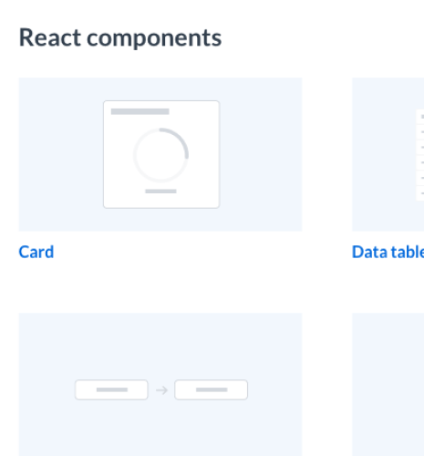
React Components
Thanks to my role as a Design Technologist, I was able to take design patterns and bring them to life as reusable React components. This helped speed up our engineering team's work, as I was often able to hand off a working component that they could plug-and-play. When I wasn't building the components myself, I also provided front-end assistance and conducted audits to ensure components I didn't assist on were aligned with the design patterns.
Data Visualizations
A critical piece of the design system was data visualizations. The internal tools that used the Atlas Design System relied heavily on various types of charts and graphs to communicate trends and anomalies in data. Our team set out to improve and standardize these charts by creating standards for:
- What type of chart is best suited for different types of data
- An accessible color palette
- How charts should scale responsively
- Guidelines on how to label data
- Limits on the number of data sets per chart
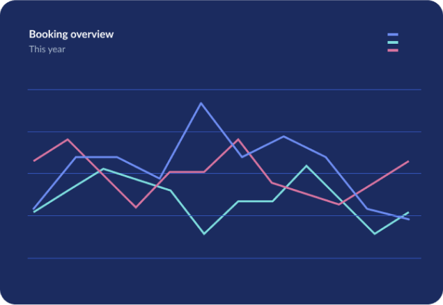
Accessibility was a major consideration for this work, and our team, led by designer Doug Cloud, worked through a number of iterations to ensure the color palette was visually appealing, communicated the data clearly, and was inclusive for those with visual impairments.
Outcome
The Atlas Design System sped up the workflows of our internal productivity tools team, allowing designers and engineers to focus on the larger product experience and not get caught up in smaller implementation details. The collection of React components and accompanying documentation were also utilized by other engineering teams across Vrbo and Expedia Group, which provided consistency across a number of other internal tools that often did not have dedicated designers.
The work our team did to standardize data visualizations was also adopted across Expedia Group, creating a universal standard for displaying data in an inclusive and easy-to-understand format.