Event Site for ElixirConf 2023

Goal
Design a new look for ElixirConf's 2023 event website, handle the front-end implementation, and continue providing support for adding new features as the event date grew closer.

Project Overview
ElixirConf is the premier conference for Elixir developers and enthusiasts, and has been held annually in the US since 2014. Set to take place in Orlando, Florida, they were looking for a fresh design for the 2023 event website to share event details and registration information.
Some of the highlights of this project included:
- Incorporating the event's location into the design
- Building out components and templates in Elixir and Phoenix
- Integrating Tailwind for flexibility and easier hand-off
- Rapid design iteration in a local development environment for new feature additions as event details were confirmed
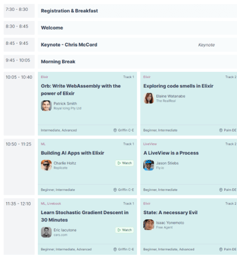
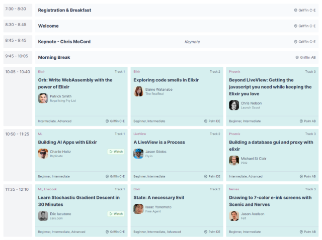
- Designing a responsive, multi-track schedule
- Leveraging Phoenix LiveView's JS commands to handle JavaScript interactions
Incorporating Orlando
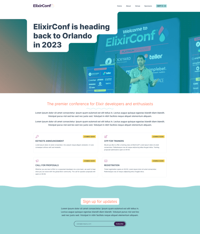
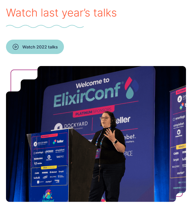
Since the event website changes every year, this was an opportunity to incorporate some fun design elements inspired by the venue's location in Orlando, Florida. The color palette is intended to evoke relaxing vacation vibes, without straying too far from ElixirConf's own colors. I added staggered edges to emulate how the city and wetlands cut into each other, as well as wave details throughout as a tie-in to the water parks in the area.
Because we didn't know the full scope of what was needed for the site through all phases leading up to the event, the initial designs focused on defining structure and design elements. This was a bit of a different case from normal client work I'd done in the past where I'd design everything early on. Instead, we aimed to get an initial design launched quickly to share the event date and venue, and would continue adding details as they were confirmed.
Development
When it came time to implement the initial design, I worked closely with the conference coordinator, Jim Freeze, who stood up an initial skeleton for the site with Elixir and Phoenix. I then built out templates and function components for all of the design elements, and Jim handled the data integration and back-end services. We continued to iterate on the design as new features were added.
One of the critical pieces of this build was that it needed to incorporate Tailwind, a utility-based CSS framework, so that it could be easily updated without the help of a designer or front-end developer. I extended Tailwind's theme config to include the colors from the design and leveraged the framework's utility classes across all elements. Since this was a relatively simple site, the only custom CSS that was needed was for design elements like the wave effects and image masking for the homepage hero graphic. Even adjusting elements to change layouts for different display sizes was handled with Tailwind.
On-the-fly Design
While the initial design was done in Figma, additional features and iterations were done entirely in Elixir and Tailwind. Thanks to Phoenix's live reload feature and Tailwind's robust set of utility classes, it made it easy to quickly iterate through design options locally. This was the ideal workflow since we needed to add new features like event registration and the schedule quickly.
Outcome
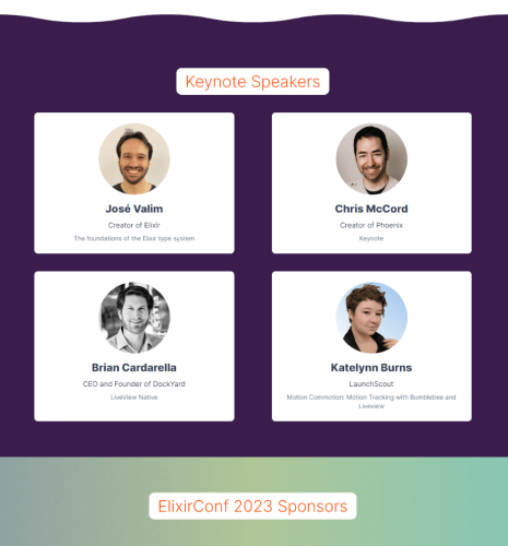
The ElixirConf website was continually updated leading up to the event with keynote and speaker announcements, a list of sponsors, workshop details, a full schedule with talk descriptions and speaker bios, and a third-party registration integration.
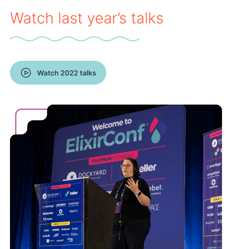
The conference itself was a great success and I was lucky enough to be able to attend virtually. Afterwards, Jim was able to update the site easily with the components provided to add links to the recordings and remove features that were no longer needed.
View live site