Multi-Brand Theme Support on the Joydrive Platform
Goal
Build tools and systems to support theming for multiple brands on the Joydrive platform that can be utilized across Figma, Sass, the Elixir codebase, and HTML emails.
Project Overview
Joydrive was continuing to grow the technology side of their business and needed a strategy for implementing theming to support multiple brands with varying levels of customization. I led the initiative to create a set of systems and tools that could be utilized across Figma, Sass, the Elixir codebase, and HTML emails to ensure we were meeting each brand's needs.
Some of the highlights of this endeavor included:
- Devising a strategy of layered themes that allowed varying amounts of flexibility
- Creating design tokens for each theme and setting up the Tokens Studio for Figma plugin to manage and apply them
- Collaborating with other designers to implement design tokens and theming through CSS variables and Sass
- Writing a color contrast checker in Elixir to ensure text over user-entered background colors meets minimum color contrast guidelines
- Auditing designs and the Sass files to clean up nonstandard token usage
Layering Themes
Joydrive offers several different technology solutions which impact the level of customization for the brands using them. Marketplaces are more all-encompassing and thus need to offer more flexibility on the overall appearance, while pre-sale and digital retailing tools are essentially an extension off of an existing marketplace with a focus on a specific brand.
Because of this, we needed to support several different types of themes that built off of each other:
- The global theme would contain all of Joydrive's design tokens and variables that all other themes would build off of.
- Base themes would act as the base for additional marketplaces built on the Joydrive platform, and have the option to override most design tokens from the global theme depending on the brand's needs.
- Layered themes were based on either the global theme or the base theme, depending on the marketplace, and were largely used for digital retailing. These themes had much more limited overrides to maintain cohesion with the marketplace, while still allowing for some brand customization.
Here are a few examples of how themes would be layered:
- Joydrive is the global theme.
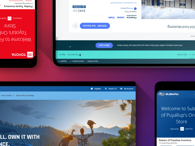
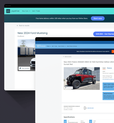
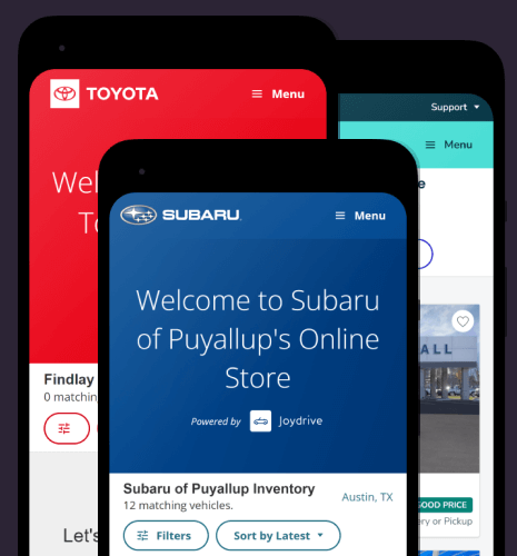
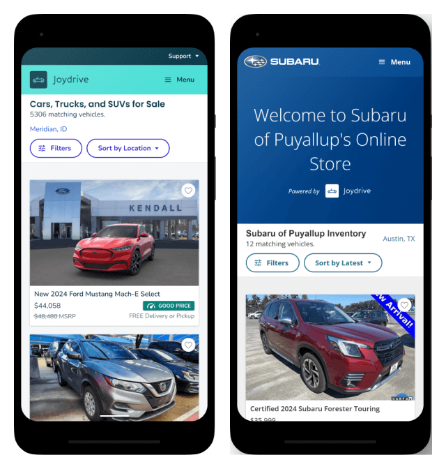
- Digital retailing tools for Subaru and Toyota would be layered themes with their own logos and colors, while using Joydrive's base styles.
- Polaris Xchange is a base theme. It overrides many of Joydrive's styles.
- Pre-sale for Indian Motorcycle would be a layered theme with their own logo and colors, while using Polaris Xchange's base styles.
Design Tokens
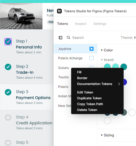
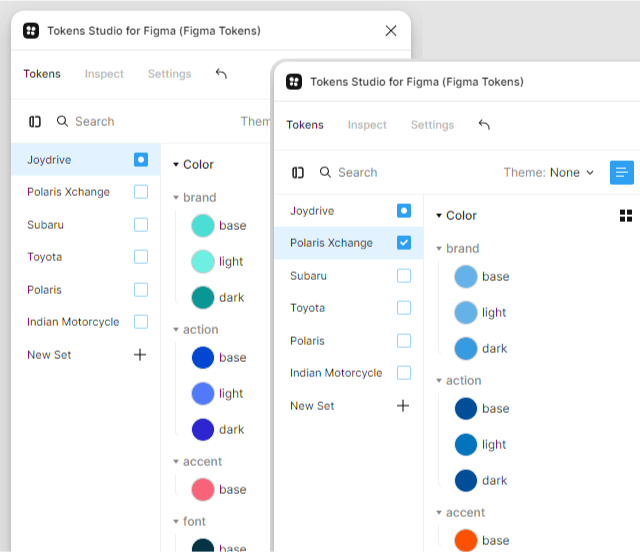
With an understanding for how many themes we needed and how they would layer, it was time to create the design tokens. I used the Tokens Studio plugin to handle design tokens in Figma, with the tokens themselves being stored in JSON in a GitHub repo. Having a dedicated repository for design tokens made it easy for all designers to stay in sync and have a historical view of changes that get pushed through.
The plugin made it easy to add our layered theme approach, with Joydrive serving as the global theme. The global theme contained tokens for colors, fonts and text styles, spacing, icon sizes, border styles, and box shadows. Base themes were layered on top of that, such as the one for Polaris Xchange. Since Polaris Xchange has significantly different styles than Joydrive, the base theme defines its own tokens for colors, fonts and text styles, border styles, and box shadows, while spacing and icon sizing are inherited from the global theme. Lastly, layered themes sat on top of either the global or base theme and only contained tokens for colors and fonts. These were utilized for brands like Subaru, Toyota, and Indian Motorcycle.
Our design team would use the Tokens Studio plugin to apply these tokens to Figma designs to both ensure consistency and easily generate mock-ups for different brands. We were also keeping a close eye on Figma's work on variables and hoped to eventually transition everything once we saw enough coverage for all of our needs.
Theme Implementation
Themes were implemented using a combination of CSS variables and Sass. CSS variables were used for tokens that could be overridden by any theme type, while Sass was useful for base themes since they needed more extensive customization options.
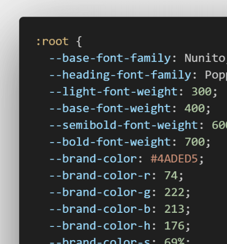
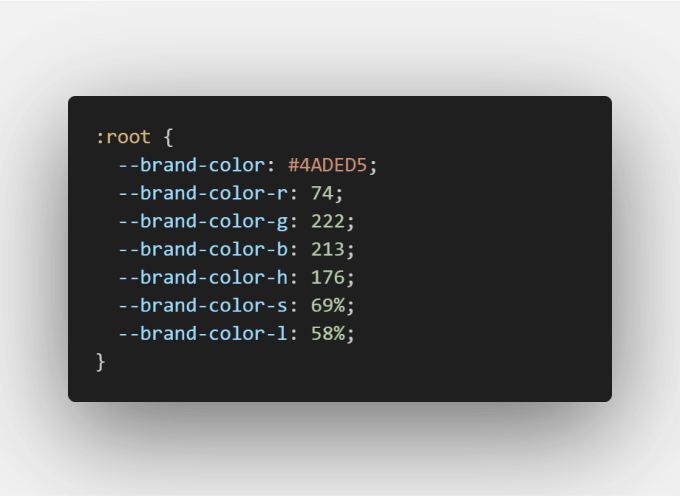
CSS variables were defined for font families, font weights, and all theme-specific colors, with each color broken into individual values for RGB and HSL. Breaking the color variables into these individual values allowed us to adjust them slightly with Sass functions for things like hover effects or gradients.
The Sass made use of these CSS variables, but also had its own set of variables for customizing the base themes. The global theme would define customizable variables with the !default flag, which could then be overridden in the manifest file for the base theme's Sass. Each base theme generated separate CSS to prevent brand contamination and keep the final output lean. Layered themes then used the base theme's Sass and only adjusted the CSS variables.
Accessible Text Colors
While our team had full control of the colors for the global and base themes, the colors for layered themes were added by dealer admins. This meant text colors in certain situations may or may not be accessible. To tackle this problem, I created additional CSS variables to define what the text color should be against user-entered backgrounds and updated any components that used these background colors to set the font color with the new variable.
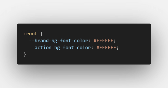
The values for these variables would be handled on the Elixir side, where I wrote a function to check the color contrast between the user-entered background color and white as the text color. If it didn't meet the minimum color contrast ratio of 4.5:1, the text color would be set to black instead of white. Since this was on the Elixir side, I leveraged the Chameleon library to handle converting the uploaded Hex values into RGB and HSL, with HSL being necessary for determining the color contrast ratio. I even discovered a bug with the library's HSL conversion while testing with multiple brands and submitted a pull request.
Outcome
The implementation of multi-brand theme support on the Joydrive platform was very successful and continues to be leveraged, both in Figma and on the front-end. This work was critical to the launch of Polaris Xchange, and as Joydrive continues to grow its brand partnerships, they now have the foundations in place to add new themes and brands in the future.