E-commerce Website Launch for PXG
Goal
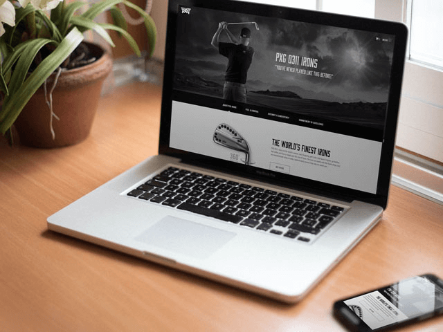
Build an e-commerce website with support for multiple languages and a focus on highlighting the technology behind each golf club and the pros who use them.
Project Overview
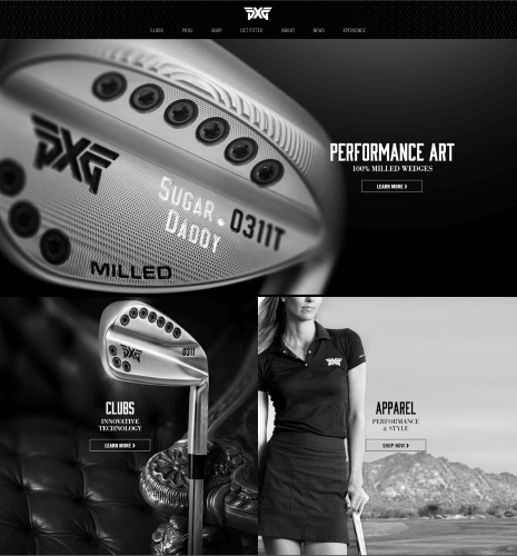
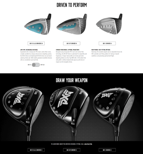
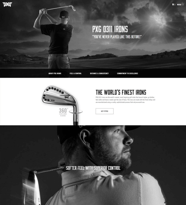
The newest golf equipment company on the scene, PXG was looking to make a splash in the marketplace with a website that boasted the quality of their products. Our team at BIG YAM achieved this by crafting an e-commerce website that highlighted the technology behind each club, as well as the story of each pro that switched to PXG.
This was project was created during my time at BIG YAM, The Parsons Agency. As the lead front-end developer, my contributions included:
- Collaborating with designers and PXG's brand team to build out HTML, CSS, and JavaScript based on designs in Adobe Photoshop
- Working closely with back-end developers on CMS integration with Kentico
- Creating a library of reusable patterns and design tokens
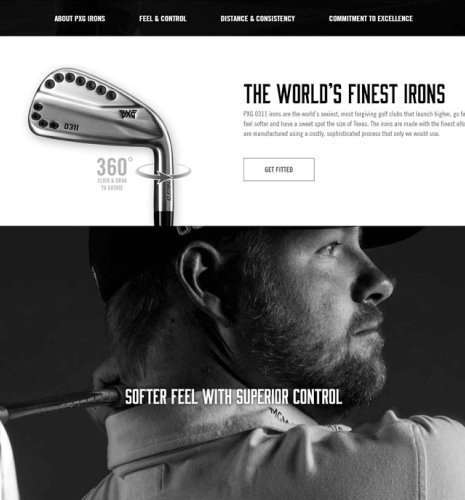
- Prototyping and implementing an interactive 360-degree club view where users can rotate each club to get a full view from every angle
- Integrating parallax scrolling features to show cutaways of the technology inside each club
- Customizing an embedded Google map for locating retailers
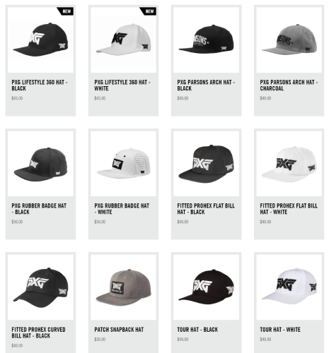
- Styling Kentico's e-commerce integration to make it cohesive with the rest of the site's design
- Building a custom solution for responsive embedded videos with placeholder images and branded play buttons
- Ensuring the design adapts to multiple languages
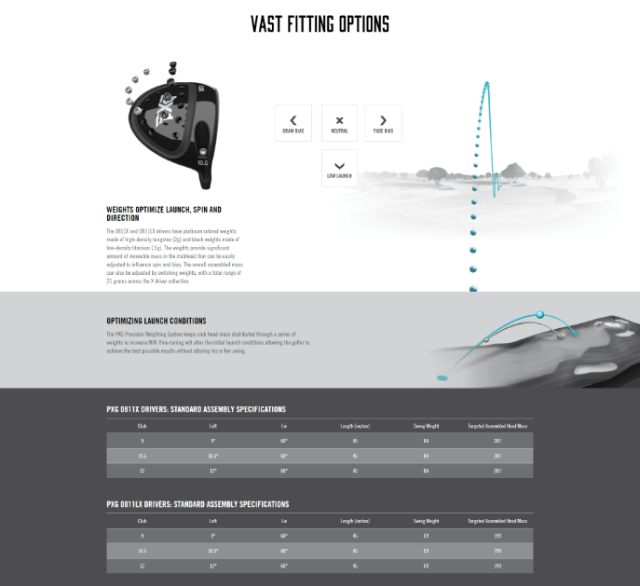
- Extensively testing the responsiveness of the site against a suite of browsers and devices, especially for interactive elements and specifications tables
- Building custom HTML email templates and testing across a number of email clients
Development
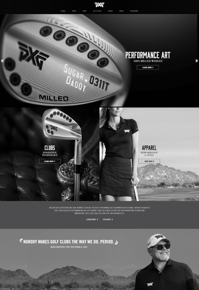
The site was built on Kentico using ASP.NET, which made it easy for the front-end and back-end teams to work simultaneously thanks to the MVC framework. My role as lead front-end developer was to build out the front-end portion of the app, including marketing pages, product pages, and the e-commerce flow, with a focus on interaction design, storytelling, web performance, and responsiveness.
Our team continued to manage the website after launch through adding new products to PXG's ever-expanding line, featuring new pros as they signed with the brand, incorporating marketing campaigns, and iterating through the site's design based on analytics and customer needs. We also worked to add support for multiple languages over time, including Korean, Japanese, Taiwanese, and Chinese.
Challenges
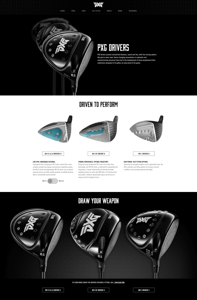
As expected with such an ambitious product launch, there were a number of challenges our team faced along the way. One of PXG's goals with the site was to showcase the technology and power of their club designs, which we accomplished with a number of interactive elements. Our designers worked closely with PXG to come up with the ideas behind these interactions, and it was my job to execute them in a way that was easy to use, visually appealing, performant, and responsive.
I iterated through multiple prototypes and collaborated with our designers to ensure the final product met their vision. When PXG launched, our team received praise for these interactive elements as being both a great experience and storytelling device. At the time, no other golf equipment company website had these kind of features.
Additional Work
In addition to the website, I also worked on a number of HTML email templates, RSVP event forms, a sales portal, a style guide, and lots of documentation.
All of the email templates were tested in Litmus and deployed through MailChimp. As the PXG team's needs grew, I reworked templates to use MailChimp's templating language, giving their team the flexibility to quickly update content and imagery without a developer's help.
Outcome
PXG had a successful launch and our team at BIG YAM continued to iterate and add new features to the site over the years as the company's presence grew.
Between the innovative website and marketing campaigns crafted by BIG YAM, PXG was able to quickly establish themselves in the market. The company saw explosive growth and is now an internationally recognized brand with retailers and distributors around the world.
The PXG website received an ADDY Award in 2016 for our responsive design work.