Website Redesign for Joydrive
Goal
Redesign Joydrive's website to better incorporate their expansion into building technology solutions for external clients, as well as refresh the design that hadn't changed much since their start-up days.

Project Overview
As Joydrive expanded from being an automotive marketplace into building technology solutions for external clients, they were in need of a website refresh to reflect their growing business and give it a face lift from their early start-up days.
I was the lead designer for this project and focused on a few key areas:
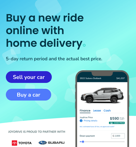
- Merging the messaging for customers using the automotive marketplace with the new messaging that the company builds technology solutions to help power other marketplaces and tools like digital retailing
- Updating the company's brand colors to meet color contrast minimums for enhanced accessibility while maintaining the existing brand integrity
- Bringing new life to page designs with a clean and modern UI that incorporates the company's message that car buying should be fun
- Leveraging fresh design elements to stand out from similar competition
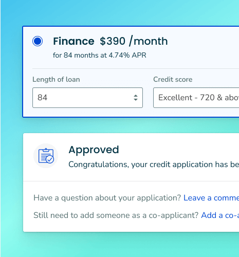
- Reworking the information architecture and copywriting for marketing pages to ensure copy is more digestible and potential customers have all the information they need to get started
The Design Process
After talking through the objectives with my product manager, I began by reviewing the existing site from the lens of a potential customer, taking note of the existing copy, information architecture, and calls-to-action. From there, I conducted market research on competitors, began sketching and wireframing out design ideas, and worked through multiple iterations in Figma.
I went through multiple rounds of feedback from the other designer on the team, product managers, and our founder & CEO to ensure both the design and the content reflected the goals of the redesign.
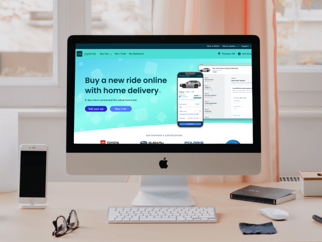
The final design makes use of bright colors, gradients, curves, and shapes to bring a level of fun to an otherwise clean, modern look, without being too dramatic. This makes Joydrive stand out more among the competition without sacrificing critical messaging for customers.

Design Challenges
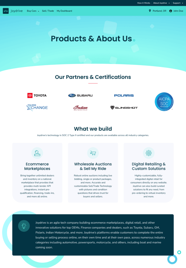
One of the challenges of this project was meshing messaging for customers looking to buy a car with sharing the company's technology offerings. While most of the homepage is more geared towards the car buying process, we also feature a blurb about the company that establishes what they are for new customers, informs users that they also create technology for specific brands, and includes a call-to-action to learn more about the company. This was a critical piece of the design to push potential partners to the about page.

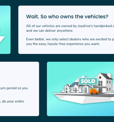
The about page includes more in-depth details about the specific types of solutions the company offers, industries serviced, technology the company utilizes, and a call-out to their SOC 2 Type II certification, which was important to highlight for security-conscience partners.
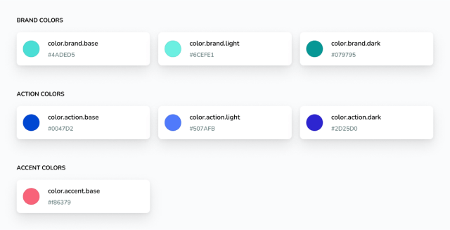
Another challenge was updating the brand colors to meet color contrast minimums without drastically changing the brand identity. The original colors were not accessible against white backgrounds or with white text, and appeared too dull with dark text. I worked through extensive iterations of the palette to find options that were accessible, looked good, and brought an air of freshness to the larger design.
I also introduced light and dark iterations of these colors to extend the range of uses against varying backgrounds. I've found this to be more effective in practice than opening up a larger range of color steps, as it forces designers and developers to make more informed decisions about color usage rather than picking one from ten steps at random.
Elixir Development
Once the design was approved, I also handled the implementation in Elixir and Phoenix. This included:
- Updating design tokens across Figma, Sass, and our CSS variables used for multi-brand theming
- Creating new components and templates in Elixir and Phoenix
- Prototyping and implementing a new homepage animation
- Ensuring multi-brand theme support remained intact with no changes to Polaris Xchange, which uses an entirely unique design
- Thorough testing for site responsiveness
- Writing JavaScript for the new animations on the home and about pages and ensuring it only plays when visible on screen
- Preparing new image, logo, and icon assets for multiple screen sizes
- Removing/refactoring old code to reduce code bloat
Outcome
With the launch of the redesign, Joydrive was able to start more conversations with potential partners interested in their technology offerings.
The company also saw a decrease in the number of customer support messages for common questions that were now properly explained in the updated copy.
View live site